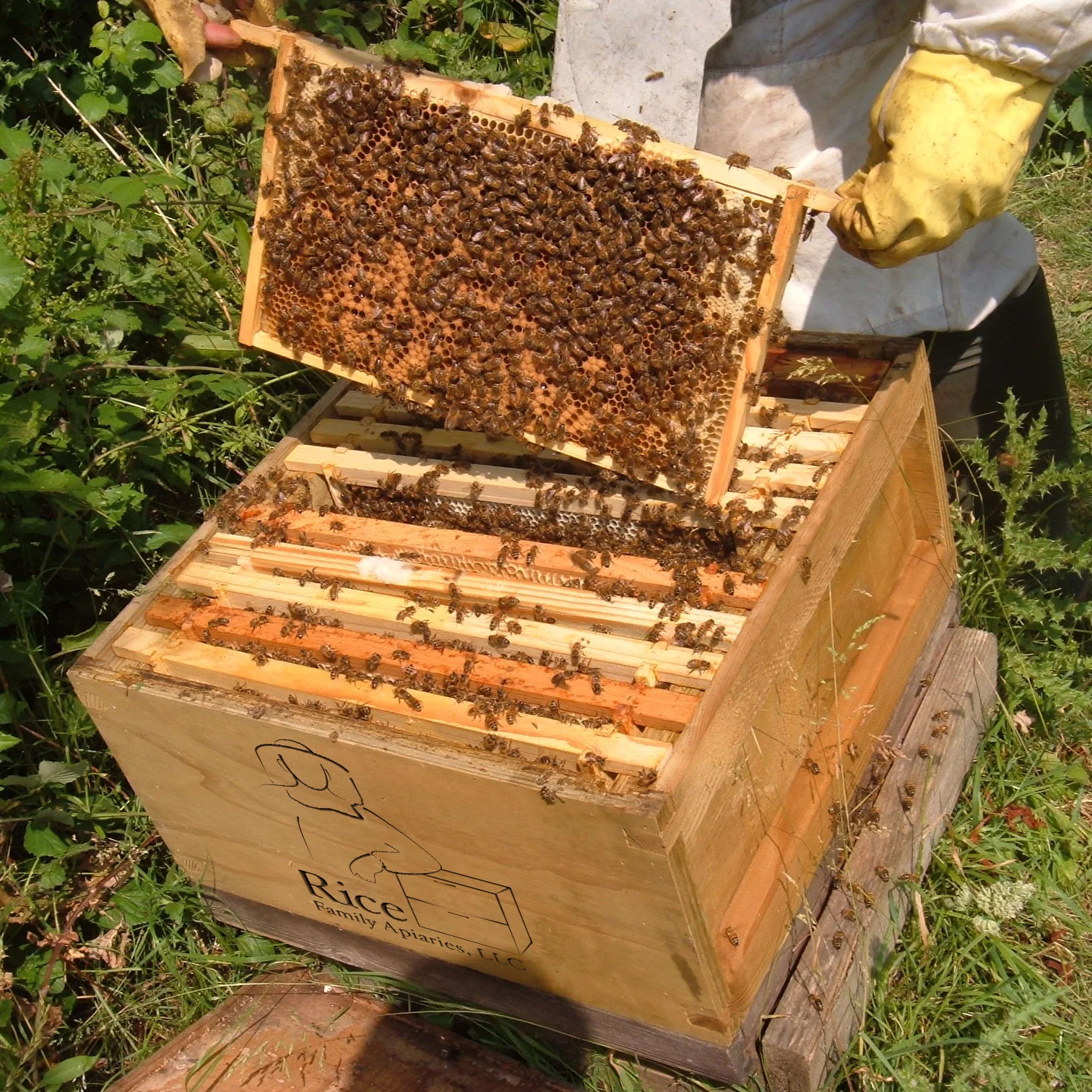
rice family apiaries logo
i was presented with an interesting challenge for this logo design. first of all this will be a one-off logo for an existing, well established brand to be used only on bee-hive boxes. second they wanted both a beekeeper and hive in the logo. third they were looking for something sleek, minimalistic, and similar to the picture on the right.
i have to admit, at first i thought they were crazy. a simple drawing of a person and a box that looks like this car? i thought, "never gonna happen." but then i got down to work. i quickly discovered that drawing a beekeeper is tough - little details added in or taken out changes the look so quickly. but eventually i got to what you see below. i think it fits the brief and the client agreed!